
This wonderful 3BHK flat was designed and executed in 2021 in Salarpuria Sattva Magus. The total value of the project was around 25L and was executed in a little less than 3 months. We have used polyurethane as well as liquid acrylic in abundance which has resulted in a lovely home for the family. Primarily, neutral and toned down pastel shades were used in most places to give the home a fresh and happy feeling.
The kitchen has been designed using liquid acrylic finish in a very light grey shade. The actual floor plan had a parallel kitchen which continued to a parallel “utility” area which was actually inside the kitchen totaling around 14’ in length and 8’6” wide. We changed this into an L shape kitchen as you enter with the cooking area on the opposite wall. Space in utility was left for a washing machine and on the opposite side, another counter was built with sink and space was left for a refrigerator. Check more information about Modular Kitchen designs article
We twisted the original builder given plan because that provided space for refrigerator almost at the entrance which was highly inconvenient. Since the builder agreed to provide the counter top and backsplash tiles without fixing them, there was a less of an issue.
The color of the entire kitchen has been kept glossy to avoid finger marks to be visible and it does lend its own charm to the room. Since the space is small, only a small 2’ chimney and hob have been installed. Apart from that, the basic hardware consists of:
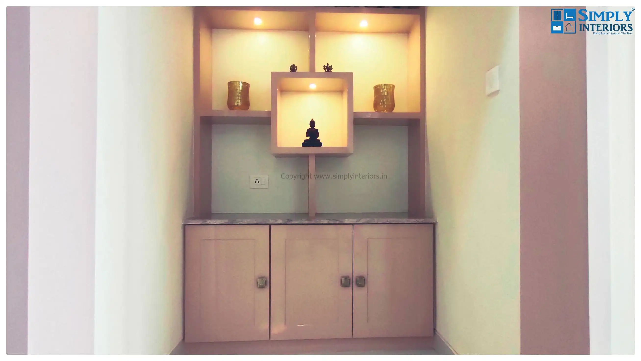
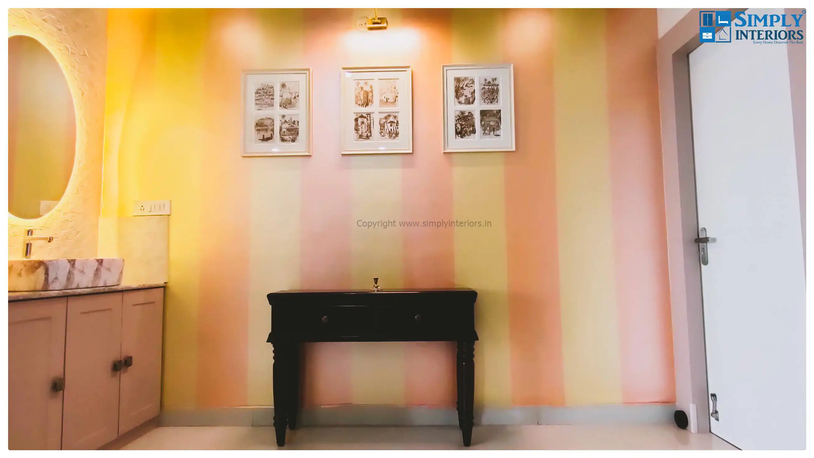
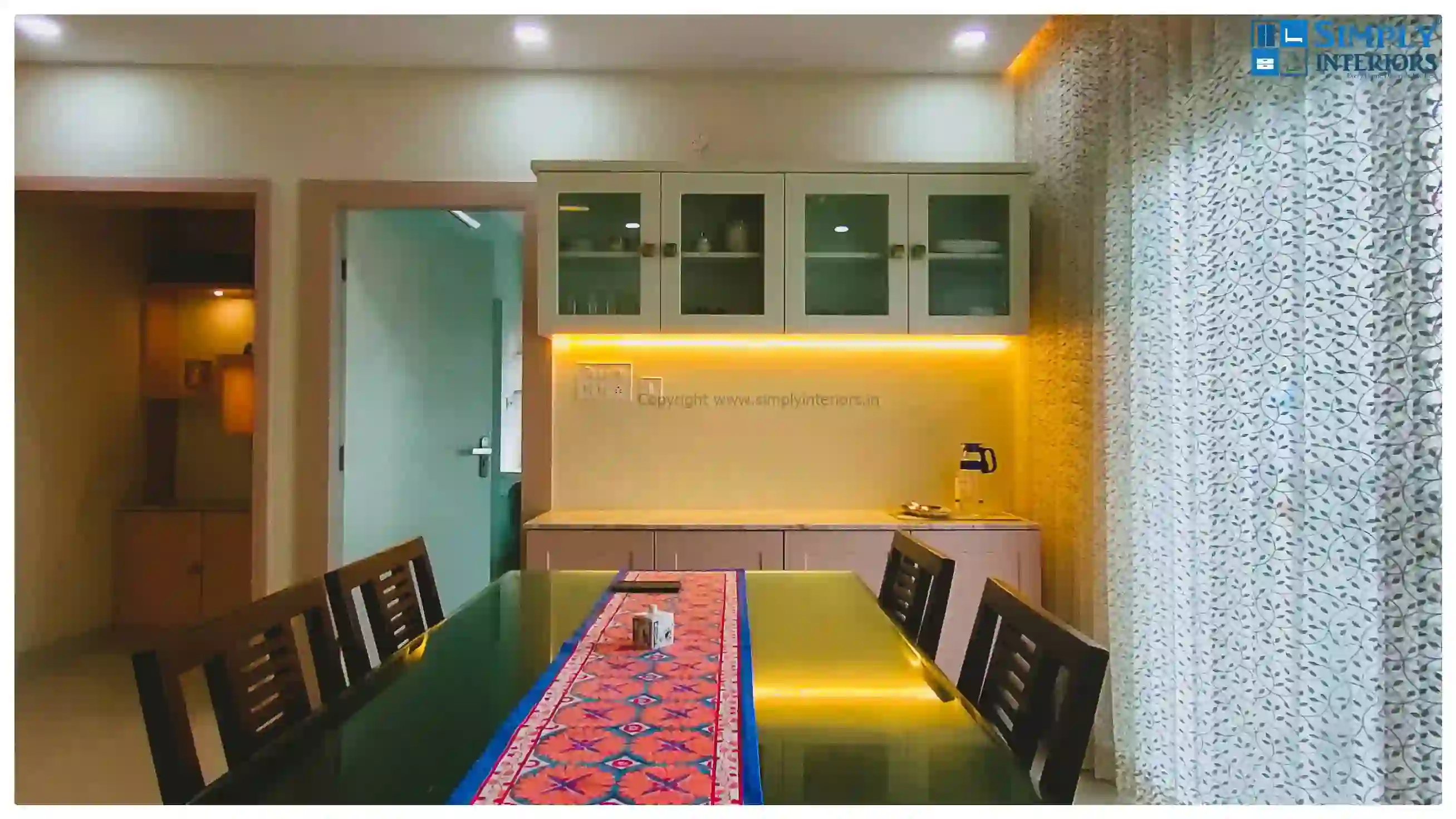


The living room is big and extends almost 30’ from entrance to the balcony doors and 13’ across. A small puja on one side and a washbasin on the other. The entire room has been designed with PU polish of a very light pastel beige mood in mind.
Pooja Room: The family did not want a very elaborate pooja room since they did not want one in the way. Hence a simple open shelve system was made with a nice granite top and small spot lights to finish.
Crockery unit is also very similar to the pooja room in look to maintain the theme. We will like you to take note of the work on the shutters which make the whole area look European and ensure that the shutters don’t look plain and boring.
An amazing bookshelf in the living area with a mix of glass and wooden shutters really makes the whole space look classy and rich.
The wall next to the sink has been made into a highlight wall with a pattern paint and an antique console table to complete the look.
The room has been provided with a 4 seater dining table with a glass top and a two seater sofa in the corner. The client already had a very good sofa set for the living room. To give some warmth to the room, the false ceiling has also got wooden touch with gypsum rafters being painted with wooden texture finish.
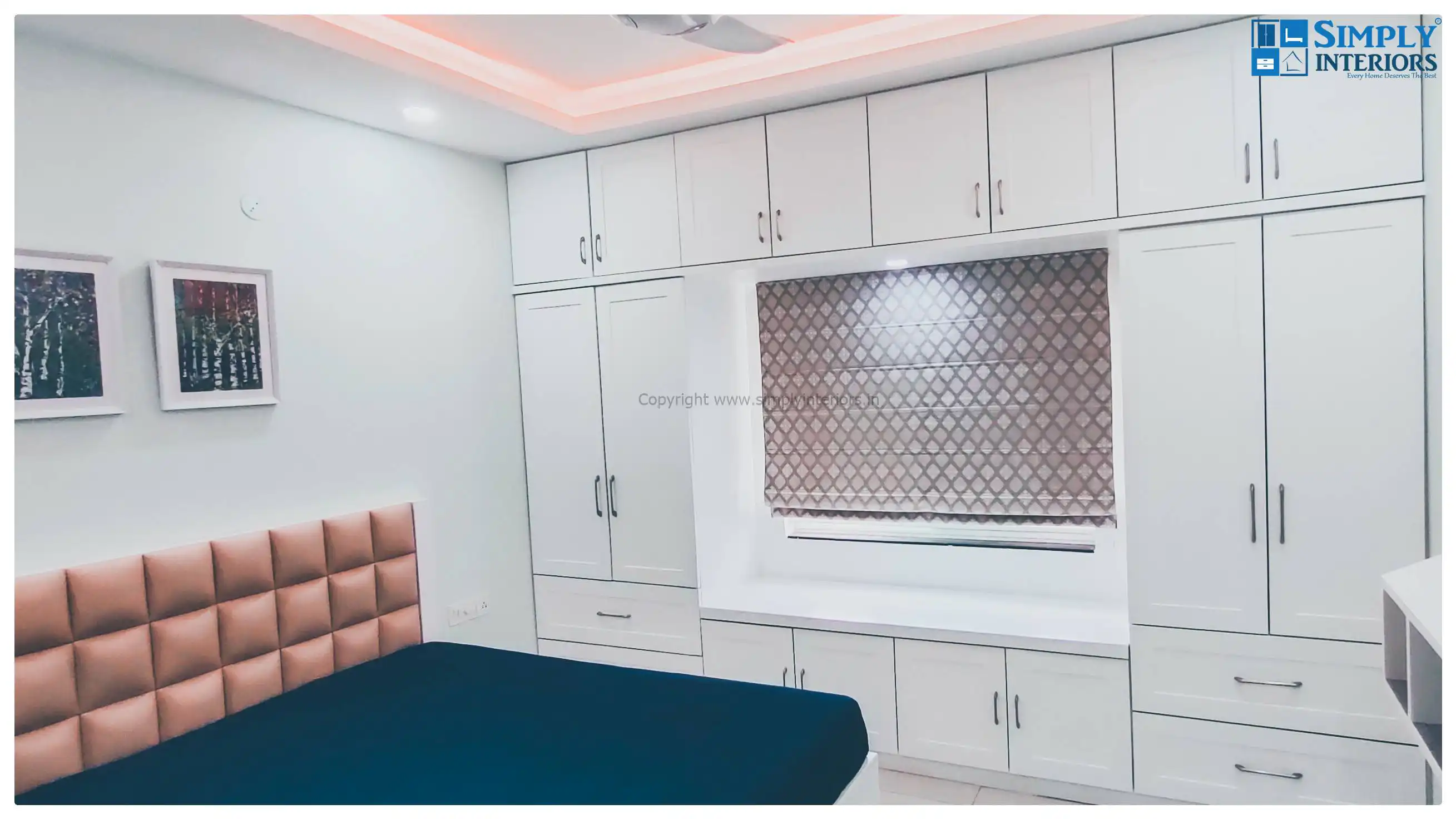
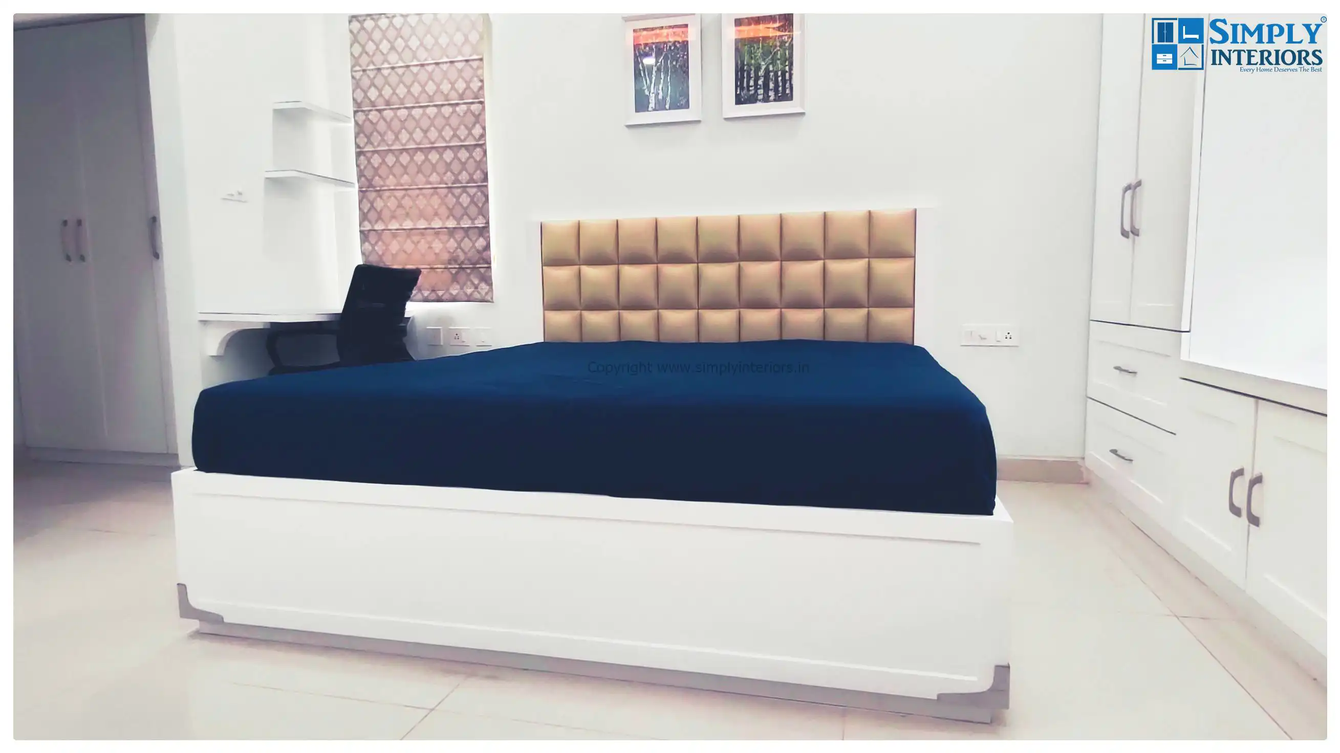

The requirement here was simple and to-the-point. Need a lot of storage space. Despite the walkin wardrobe space which accommodated a 3 door wardrobe on one side and a lot of storage plus dressing space on the other, we provided additional storage on either side of the window with more storage below it. The finish remains matte PU with the shutters designed in similar fashion as the living room.
A small study table on the side for a quick meeting with some ledges above it and a beautiful white bed with beige cushioned headboard behind it complete the look.

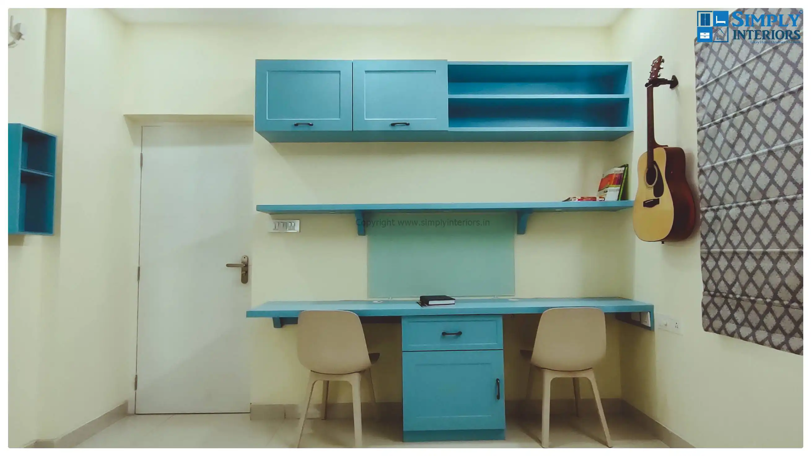
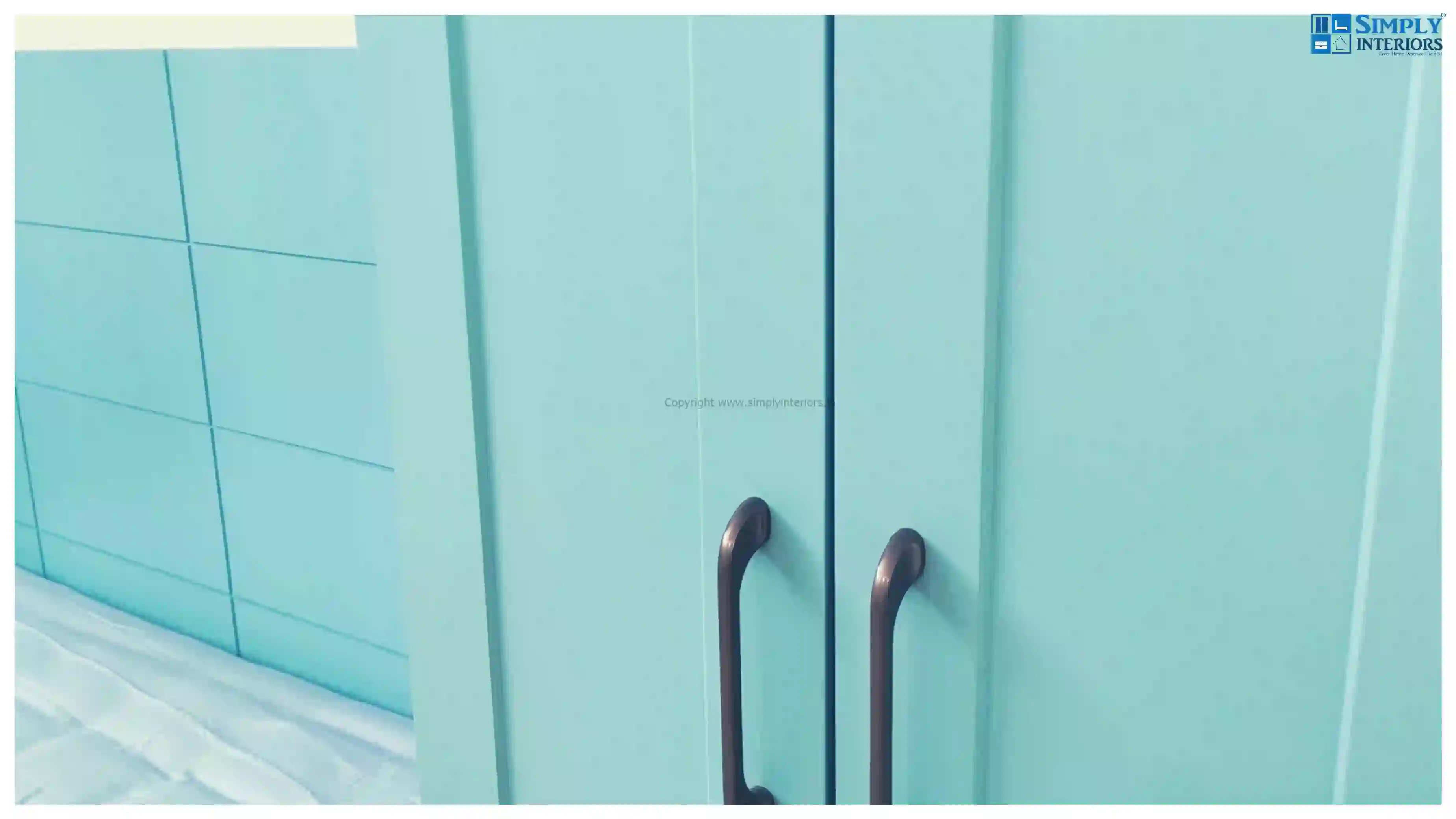
This room in our opinion is the prettiest. Made in a turquoise blue color for the daughter, it can surely cheer up anyone. The cool shade of blue along with the European shutter design makes the space look classy and elegant.
The bed has been moved to a corner to make space for wardrobe along with a double study table. Another advantage of bed moving to a corner is that it leaves the center of the room empty to be used for play / hobbies or for anything else. Since the room itself is small (around 12’X12’), it makes a lot of sense to leave the middle space empty.
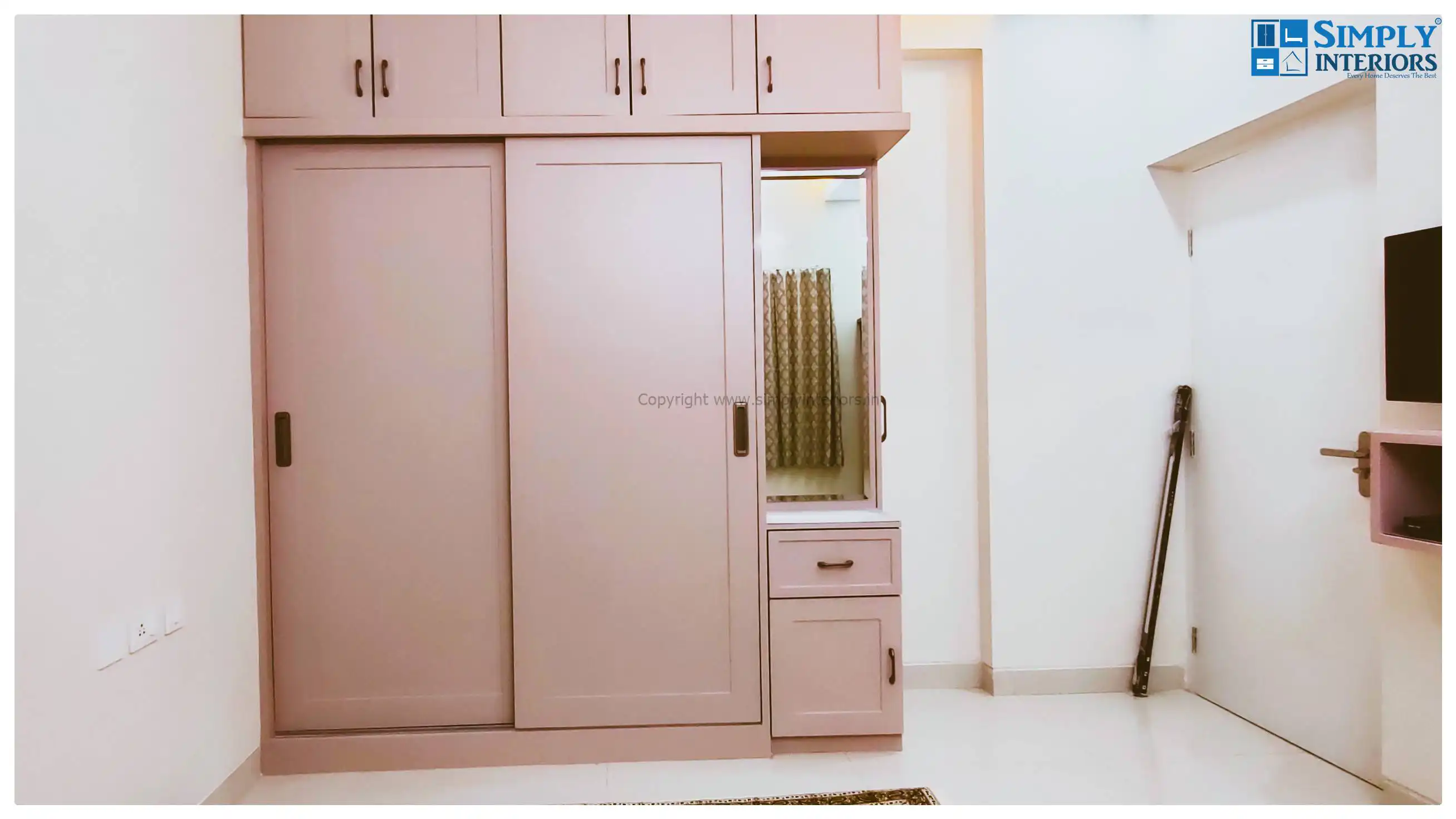

Guest bedroom is very basic but the rose color makes the wardrobes look absolutely fabulous. Sliding door wardrobes for storage as well as for the visiting family are ideal to ensure space and bring elegance to the room.
Apart from above, we also provided basic fittings in the bathrooms, utlity etc. All lighting, civil as well as movable furniture work was handled by our team.